The Role of Colour and Texture in Modern Switch Design
In contemporary interiors, switches are no longer hidden utilities but design accents that shape the look and feel of a space. Colour and texture play a pivotal role in modern switch design, transforming a simple electric switchboard into an expressive canvas. As homeowners and designers seek to curate environments with depth and personality, the integration of tactile finishes and sophisticated hues has become essential.
The Psychology of Colour in Switchboards Colour profoundly influences mood and perception. A colour switch board can either blend seamlessly with wall tones or serve as a bold focal point.
- Soft neutrals—off-white, dove grey, muted beige—promote calm and continuity, making switches almost invisible against painted surfaces.
- Deep shades—charcoal, navy, forest green—add drama and anchor a design scheme, creating deliberate contrast.
- Accent colours—mustard yellow, teal, terracotta—inject warmth and character, aligning the switchplate with decorative accessories.
By selecting the right palette, designers and homeowners can ensure that each switchboard contributes to ambience, visual flow and the overall narrative of a room.
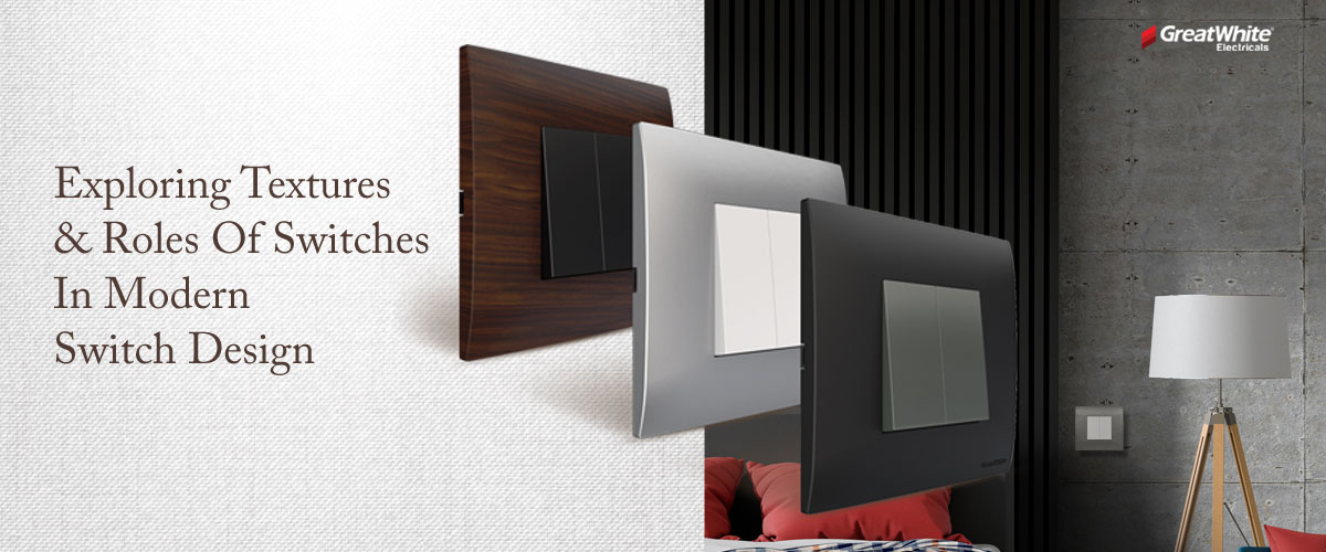
Texture as a Sensory Statement
Beyond colour, texture invites users to engage—literally—with the switch. Matte surfaces absorb light and feel velvety under the fingertips, while glossy finishes reflect and highlight. Textural contrasts can be used strategically:
- Brushed metal plates add industrial chic and subtle sheen.
- Engineered polymer with finely ridged patterns offers both grip and interest.
- Wood-grain laminates bring organic warmth and tactile richness.
These textural choices not only enhance aesthetics but also improve ergonomics, making switches more intuitive and satisfying to operate.
Harmonizing Colour and Texture
The magic happens when colour and texture work in tandem. A textured matte plate in a pastel hue creates softness without slipperiness. A high-gloss black rocker on a metallic bezel delivers sleek modernity with a convincing weight. When both elements align, the switchboard becomes an integrated design feature rather than an afterthought.
Brief Spotlight on GreatWhite’s Switches
While colour and texture are universal principles, GreatWhite showcases how these concepts come to life across their switch brands:
- Trivo: Ultra-smooth matte finish in TruBlack, TruWhite, TruMagnesium—no paint or coating—exudes minimalist luxury.
- Arcus & Arcus Q: Curved plates and low-rise rockers with options in technopolymer, crafted metal, glass or vintage-style toggles for that refined click.
- Fiana: Chrome-edged Evo Plates and vibrant glossy colours balanced with F-Wood textures for a fusion of art and technology.
- New Myrah: Flat, sleek panels in subtle shades engineered for durability and whisper-quiet operation, ideal for hospitality and residential projects.
Each range illustrates how materiality and hue can be tailored to specific design intents—from luxury living rooms to high-end office spaces.
Designing Your Next Colour Switchboard
When choosing switches, start by mapping your room’s palette and textures:
- Identify dominant wall and furniture colours.
- Decide whether your switchboard should blend or contrast.
- Select a finish—matte, gloss, metal, wood—based on both look and feel.
- Explore module configurations and plate shapes to suit rhythm and proportion.
A thoughtfully chosen designer switch becomes a deliberate accent, echoing your decor while adding sensory delight. Embracing the interplay of colour and texture in switchboard design transforms everyday interactions into design moments. With GreatWhite’s versatile offerings, you can curate switches that not only control light but also illuminate your style.